Designer Spotlight: Wyndsor Hug
Lydia Kellams

As much as I love a good rebrand, I think I enjoy the behind-the-scenes details of the process even more. To share a bit of Storyware’s own rebranding process, I’m writing a series of posts titled Rebrand Recapped. Each post in the series will focus on one component of our brand system and the decisions and process that went into it.
Many factors prompted the decision to rebrand Storyware, and the wishlist for our new system included the following:
I took all of this into account before beginning the design process. And I also revisited the stellar research conducted by our brand strategist, Kate Hofstra. (Todd wrote a great article on Storyware’s brand strategy process last month.) This research, combined with a shared vision, set the tone for the work to come.

With a better understanding of Storyware’s goals, I shifted gears to researching our industry. This included brand audits of other digital studios to get a sense for regional and global trends. Spreadsheets like the one below were helpful conversation starters for discussing context, content, and how we felt Storyware should move forward.
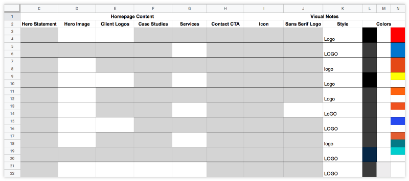
Here were some take-aways:
While I wanted to explore some of the more adventurous trends I was seeing, I learned to be mindful of the clients we serve and the services we promote. The new Storyware needed to be approachable to both the Virginia-grown-manufacturing-industry-client and the internationally-recognized-non-profit-client. While one might love a sophisticated serif or sideways type, the same details might leave the other saying “what the heck”.
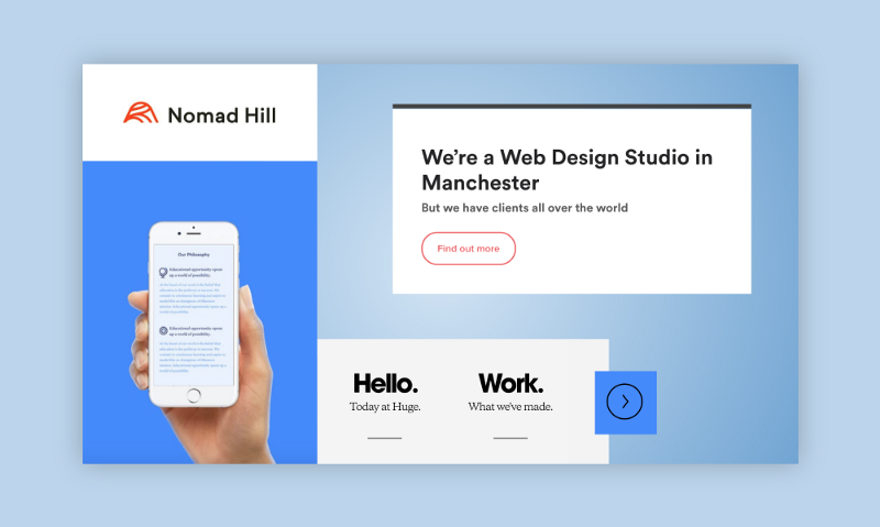
At this point, I had an idea of what was being done and what we wanted to do. So I took a stab at a few moodboards. These acted as jumping-off points for design and are very rough. (As in, a hodge-podge of screenshots and Pinterest grabs from across the internet, thrown together in Google Slides. Please don’t report me!)

A Short-hand Response to Mood Board № 1: We like the boldness of this mark, the all-caps, the simplicity, the grid, and the white.
A Short-hand Response to Mood Board № 2: Everyone is doing this super rounded, geometric sans serif. We think it feels too trendy.

A Short-hand Response to Mood Board № 3: We like the all-caps and the simplicity of it all. But the monospace type feels a bit trendy, will it last?

A Short-hand Response to Mood Board № 4: We like the logo by itself, but if we’re going to go with a “Swiss” look we need more white space. We either like the icons or we think they’re too thin.
If research showed us anything, it was the importance of a clean, scalable wordmark. It’s something all of the brands we looked at had in common. We knew it would appear in every application of our brand, from print to digital to screenprinted merch. And while it’s wise to have an icon or monogram to use in conjunction with a strong wordmark, the wordmark is the foundation.
With that in mind, we decided the wordmark would be the first deliverable of our rebrand. I would begin with black and white type exploration. From type exploration, I would create a custom wordmark. And from there, we would work backwards to establish typography, icons, color palette, etc.
To give y’all a sense of the process, my first Illustrator file had 83 artboards. Here’s a glimpse:
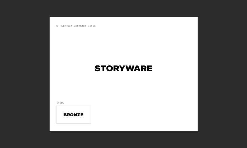
I began by recreating marks from favored moodboards. One notable difference is the impact the, erm, word had on the wordmark. A 6-letter mark like “Bronze” is going to scale much easier than the lengthier 9-letter “Storyware”.
From there, we opened things up. We set “Storyware” in all-caps, sentence-case, and lowercase in every typeface available from Google Fonts, Adobe Fonts, and numerous foundries. I made diagrams like the ones below to compare and discuss our preferences as a team.
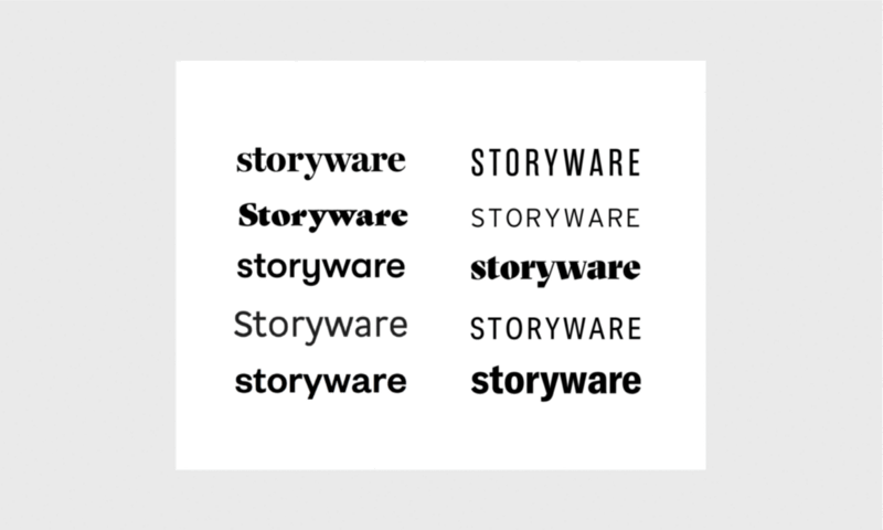

Have you ever fallen in love with a pair of jeans on a model, only to be disappointed by how it looked on your own body? That happens with typefaces, too. A few things we noticed about “Storyware”:

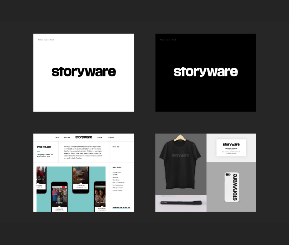
Throughout this process, I narrowed hundreds of specimens down to a few dozen that represented a range of styles. For each of these, I created a set of slides to present to the partners: a positive wordmark on a white background, a reversed wordmark on a black background, the wordmark on a mock case study page, and once more, in the context of a business card and some merch.
We were drawn to one typeface again and again, Chalet London 1960 by House Industries. We loved the way “Storyware” felt, set sentence-case in this typeface. It had a Swiss feel that we really liked, a grotesque that felt professional but also leaned in the direction of a friendly, geometric sans.

While we were digging the way “Storyware” looked in Chalet London 1960, we weren’t about to set it and call that our wordmark. So we had some fun with vector play, matching the height of the “y” with the uppercase “S”, fiddling with terminals, and testing variations of letterforms like “y”, “a”, and “e”. The GIF below shows the evolution of the logo.
The most unique detail of the final wordmark is the custom “y”. In the process of finding something that best balanced the negative space—without being too top-heavy or bottom-heavy—I found I most liked “y”s with Hobo vibes. (Who knew? ??♀️) Without actually wanting to use Hobo, I tried creating a form from scratch by flipping the double-decker “a” upside down and building from there.

I was surprised by how much I liked the resulting hybrid. Hesitant, I showed this version to the team and they liked it, too. Just to be sure, I shared the wordmark with designerds near and far, from long-time mentors to new-found crushes. Everyone was constructive and supportive. A few suggestions and tweaks later, we had a wordmark we were proud of!

Months later, the wordmark has stood up to the test of a new brand with endless applications. We’d love to hear your thoughts on our process and results, or your impression of the rebrand in the wild! If you enjoyed this article, subscribe to our newsletter and be sure to catch the next installment, Rebrand Recapped: Our Icon.