Designer Spotlight: Wyndsor Hug
Lydia Kellams

As much as I love a good rebrand, I think I enjoy the behind-the-scenes details of the process even more. To share a bit of Storyware’s own rebranding process, I’m writing a series of posts titled Rebrand Recapped. Each post in the series will focus on one component of our brand system and the decisions and process that went into it. If you didn’t catch the first installment on our wordmark, check it out here.
To quote the last post in our series, “We knew [the wordmark] would appear in every application of our brand, from print to digital to screenprinted merch. And while it’s wise to have an icon or monogram to use in conjunction with a strong wordmark, the wordmark is the foundation.”
With the Storyware wordmark complete, we moved on to icon exploration. If you’re wondering why, here are a few applications we knew an icon would come in handy:
Referencing the range of favicons from the screenshot above, we decided early on that no pictorial symbol came to mind as the end-all, be-all encompassing icon of our studio. For that reason, we decided to pursue a monogram of the Storyware “S”.
Unlike the wordmark, where we worked in Adobe Illustrator to customize our wordmark from the digital starting point of a typeface, we began icon exploration with pen and paper.

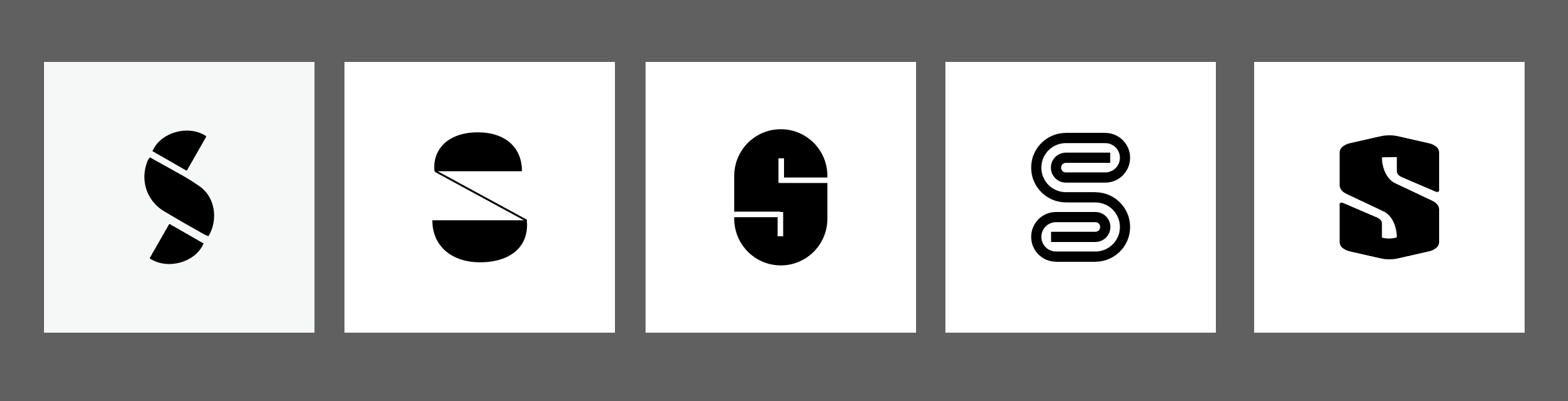
Once I got all of the S’s I had in my own brain down on paper, I turned to the internet for further inspiration. Here are a few of the S icons and letterforms that I found in the wild:

A few take-aways:
Just like wordmark exploration, we looked at potential icons in black and white first. This approach allowed us to focus on the weight and form of the marks, without being distracted or influenced by color choices.
Many of the more abstract icons were the result of playing and rearranging basic shapes (kind of like Tangram) or tracing new forms from my pen and paper sketches.
Other monograms—like the example on the far right—began as a standard “S” outlined from an existing typeface. By adding new anchor points, moving them by even increments, flipping and rotating things to a precise degree, etc. I’m able to create new letterforms unrecognizable from the originals, while controlling symmetry, consistency, and desired alignment.
A while back, a design friend gave me a great illustration tip. When creating icons or logos, it’s helpful to retain the various iterations of your progress. Before this advice, I would adjust anchor points here and there, tweak this, change that, only to realize the results weren’t working and then have to spend more time Command Z-ing my way back to the starting point.
A much better approach is to drag-and-drop-duplicate your illustration every few alterations. You’ll end up with an incremental evolution of your icon or logo—each version slightly different from the next—to compare and contrast. In the examples below, each “S” has the same underlying white shape, a rectangle with two rounded corners. The overlying black shapes are the only change, differing slightly version to version.

I presented the first round of digitally sketched icons in black and white, positive and reversed, at varying sizing. The feedback was that many of the options felt too Superman-y and nothing particularly stood out.

So I went back to the drawing board and presented the second round of icons alongside our wordmark. I also mocked up an Instagram feed to test icons in the context of social media application and introduce some potential colors.

I landed on the now-Storyware icon in mocking up the Instagram feeds below. In sizing up the “S” from our wordmark, to see what scale looked best within the frame of the circular profile picture, I loved the way the S-curve seemed to flow into the circle. Ultimately, this was the option that resonated best with Storyware’s partners.

Next came all of the decisions regarding when to use the icon, how to use the icon, and applications across various mediums. But that can of worms is for the next installment in our series.
We’d love to hear your thoughts on our process. If you enjoyed this article, subscribe to our newsletter and be sure to catch the next blogpost in this series, Rebrand Recapped: Type, Color, and Guidelines.